
University at San Marcos Campus
University at San Marcos Discloses Faculty Salary Raises
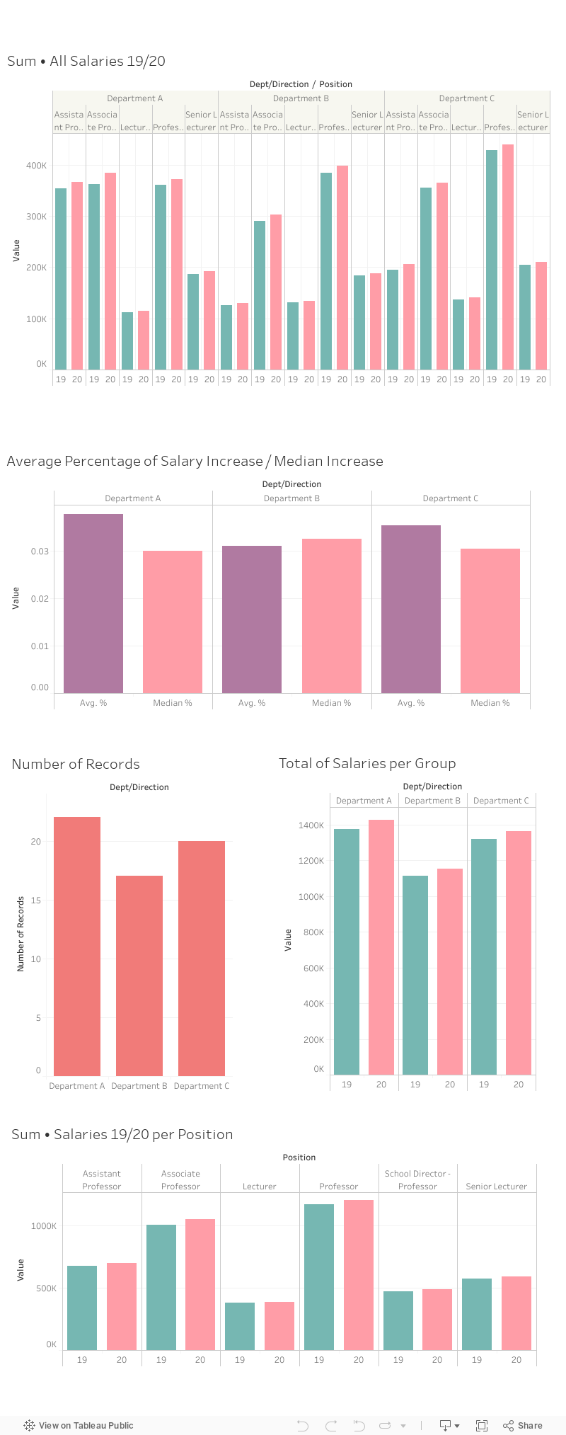
SAN MARCOS, Texas – AUG. 30, 2020 – Salary raises at the University of San Marcos reveal gaps, as disclosed on data released by the university Thursday. Salary increases vary between 0 and 10%, distributed among lectures, senior lecturers, professors, assistant and associate professors.
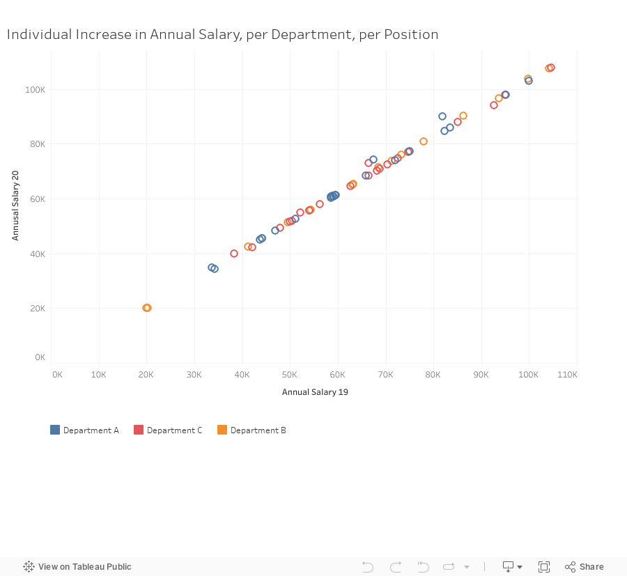
Part-time lecturers and senior lecturers received no raise, while three full-time assistant and associate professors in departments A and C received a 10% salary increase, two of these awarded to department A. The average raise for all other faculty members averages between 3 and 3.7%.
Questions for the dean:
1. Why did part-time lecturers and senior lectures receive no salary raise?
2. Why did 3 assistant and associate professors receive a 10% salary increase?
3. Why was there no 10% individual salary increase for any members of department B?
4. Why was the average salary raise between 3 and 4%, if the highest raises were of 10%?
5. Why did two lecturers receive a salary increase of more than 4%?
###
Steps for building the visualizations: First, I deleted the monthly salary columns, then I added a percentage of increase column in Excel. From the Excel spreadsheet, I had already seen some patterns, but I wanted to see if I was going to find something else with the Tableau viz. I built therefore a few tables that allowed me to calculate median increases, differences in number of records (lecturers and professors per department) and etc.
I also wanted to see where the “outliers” (the 10% increases) were in the context, so in another Excel spreadsheet I individualized the entries (numbered each record per department). This allowed me to make the last visualization (the one called “individual increase in annual salary per department and per position”).
I chose bar charts because they were the easiest to read in this case. Whenever I can, I prefer using bars or scatterplots. The last chart had to be a scatterplot because it shows individual cases.
What worked / didn’t work: First, I lost the forest for the trees and made a story about the median salary increase (which is higher in department B, despite the higher average raise in department A). Then I looked back at the obvious information and wrote about the disparity in individual raises (from 0 to 10%).
Another obvious story would be the higher salary increases in department A (copy-pasted after charts).
Seeing “outliers” (viz below)
Source: Data for Journalists: A Practical Guide for Computer-Assisted Reporting by Brant Houston
https://a.co/8sxGMyT
The Philadelphia Inquirer, used a good example of this at a national conference. He said baseball players’ salaries outraged fans because fans always heard the average salary was $ 1.2 million. But the median salary was $ 500,000, and the mode, or the most frequent salary, was $ 109,000. Those numbers indicate that there are a few players making really big money. The median, or middle, value, the salary amount that half the salaries exceed and half the salaries fall below, was $ 500,000. If you asked all baseball players for a count of hands for each salary, the largest number (the mode, not the majority) of hands would go up for $ 109,000. (Okay, it’s still a great deal, but not as much as you thought. And it’s being made by people generally making most of their money in 10 years or fewer.) Journalists want to make sure they represent numbers as fairly and accurately as possible, and these three ways of looking at numbers give them a chance to do so. If a journalist obtains a set of salaries, house prices, or test scores, he or she needs to consider what the fairest representation is. If the numbers are relatively close together, the mean (or average) is a reasonable way to summarize them. But if the numbers are spread out, a journalist doesn’t want a few bad apples, or very rich apples, to distort the summary and so a median is better.
Mean—The same as average (better forget it and say average to avoid confusion)
Median—An average that is the middle value in a series of numbers. Half of the numbers are higher and half are lower than the median.
Mode is the value that most frequently appears.
(Story 2)
Department A at the University at San Marcos Leads in Faculty Raises
Department A at the University at San Marcos Leads in Faculty Raises
SAN MARCOS, Texas – AUG. 30, 2020 – Faculty in the three newest departments at the University of San Marcos received uneven salary increases, according to data released by the university Thursday. Department A received an average raise of 3.78%, the highest percentage of all departments.
Department A leads the number of faculty members, employing 22 professors and lecturers. The average salary for Department A is $64,866, which includes two part-time lecturers and one full-time lecturer. Professors, associate professors and assistant professors receive higher salaries. At the other extreme is department B, with an average raise of 3.1% distributed among 17 faculty members.
Questions for the dean:
- Do other universities in the country also allocate more funds to their departments A?
- Why was the average increase in department A’s salaries higher than those of departments B and C?
- Why is the number of faculty members larger in department A than in other departments?
- Why was department B’s average raise the lowest of all departments?
- Why does department B employ less faculty than the other departments?